Edge-distance anti-aliasing
(You might want to go straight to the demo)
Some months ago, I noticed that the Chromium compositor, the code which powers Chromium’s accelerated compositing implementation (and also Aura!) was anti-aliasing layer edges. This was especially surprising to me since I knew for a fact that my hardware didn’t support multisample anti-aliasing yet. Some people from the Chromium graphics team, who are incredibly friendly and helpful, pointed me to a very clever bit of code they were using to do edge-distance anti-aliasing for composited layers.
Aliasing can happen when you sample a signal that has details that cannot be captured by your sample frequency. In the case of graphics, it’s what happens when features of the image exist in an area smaller than a pixel. One important feature is the edge of a piece of geometry, such as the edge of a shape drawn onto the page. When you start rotating shapes and projecting them with 3D CSS transforms, geometry that before aligned to pixel boundaries can move to the spaces between pixel boundaries.
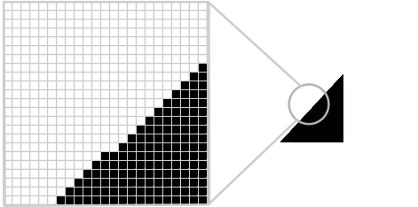
For instance, let’s zoom into the edge of triangle that we are rendering. Maybe in this case it’s half of a rotated div.

If we naively decided the color of every pixel based on whether any of the triangle covered it at all, we’d end up with a jagged edge.
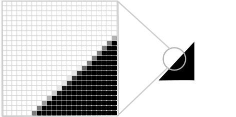
One thing we could do to make the edge smooth is to determine how much area of the pixel is covered by the triangle. We could adjust the transparency of the shape color (the alpha value) by that percentage when painting the pixel. This process is a type of anti-aliasing and the percentage that the triangle covers the pixel is called coverage.

Think of all the complicated geometric calculations we’d have to do to figure out the ratio exactly. Since we have to make these calculations for every pixel up to 60 times per second (for smooth animations), our rendering would be pretty slow if we actually did them! Instead, it’d be nice if we could somehow estimate how much of the pixel is covered and do less work. One approach is to calculate the distance from the pixel to the edge of the shape. If the pixel is more than one pixel’s distance away from the edge, we know that we should not paint the triangle color at all. If the pixel is closer than one one pixel’s distance from the edge, we should paint the triangle color, but reduced by some transparency factor.
Luckily, OpenGL can run a little program for every pixel 1 it paints. This program is called a fragment shader. We can write up this logic in the fragment shader and change the triangle color for every pixel.
Perhaps some of those reading who have had experience with OpenGL may notice here that this isn’t going to work as I’ve described. OpenGL already does something like the naive approach I talked about first. Some pixels (the ones OpenGL decided should be painted with the triangle color), will be properly anti-aliased, but many pixels will not be painted at all. For instance, if the coverage of the pixel is only 20% and OpenGL decided not to paint it, we wouldn’t even have a chance to determine how far it was from the triangle edge, because the fragment shader wouldn’t run for those missing pixels.
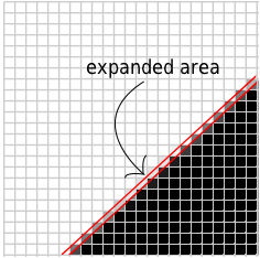
Let’s “trick” OpenGL into painting more pixels than it would otherwise. A simple way to do this is to just make the triangle a little bit bigger. In fact, we can expand all the edges by less than one pixel and OpenGL will paint all those missing pixels. Now we have smooth edges!

I spent some time implementing this for the TextureMapper accelerated compositor (and thus WebKitGTK+), so it’s not just the Chromium compositor that has this feature any longer. For me it makes a huge difference in the quality of 3D CSS content. For the purposes of demonstration, I’ve also reimplemented it in WebGL, so if you have a modern browser you can see it in action.

