I separate shadowed web content into three categories: CSS box and text shadows, canvas shadows and SVG shadows. Even though a different standard addresses each of these categories of shadows, the process of drawing the shadow remains very similar. The web rendering engine simply draws a copy of the shadowed object underneath itself with a solid fill (the shadow fill). This "shadow image" may also be blurred with a certain radius. For each of the standards that I mentioned, it is sufficient to blur the shadow image by estimating a Gaussian blur on its pixels.
A Gaussian blur is just the application of the normal distribution to the pixel values of an image. The value of a pixel in the blurred image is calculated by combining the values of the pixels around it in the original image. The contribution of a particular surrounding pixel decreases with the distance from the target pixel. Until recently the Cairo port performed an actual Gaussian blur with an expensive two-dimensional kernel. The first speed improvement involved making Ariya Hidayat's fast blurring algorithm (for the Qt port) cross-platform and using it for our own shadows. This algorithm estimates a Gaussian blur by performing multiple one-dimension motion blurs. This decreases the number of pixels that need to be read to calculate a target pixel and also increases the number of cache hits during the blurring calculation.
In the course of our work we realized that we were not clipping the shadowed area when blurring. For instance, identi.ca has one long column of content that extends down the page with a box blur. Instead of blurring just the part of the column visible in the viewport, we were blurring the entire box. This simple fix alone was enough to make most sites usable.
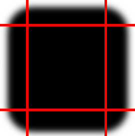
Alex performed the final and most novel optimization for box shadows. Here's an image extremely typical web content with a shadowed div.